
Very Confusing Pairs to Me🤔😥😴
Published:
This post is used for elaborating details and make comparisons of some very similar and confusing pairs to me. And I will teach you how to draw ROC/AUC by hand(The most exciting part to me).
Bias & Variance
Bias is an error from erroneous assumptions in the learning algorithm. Variance is an error from sensitivity to small fluctuations in the training set. This is the definition from Wiki. But it is still kind of confusing. To me, bias measures how far your prediction is away from the true value. Variance measures how far your prediction is away from the mean value, meaning how scattered your prediction is. Here is a very famous visualization of these two items. You can easily get my points from it.
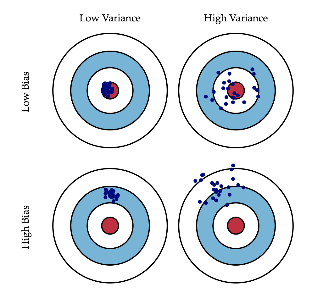
Figure 1. Bias and Variance Visualization
Then, let’s take a look at the mathematical definitions. Assuming a relationship between a covariate X and Y, let Y = f(X) + ϵ, where ϵ follows a normal distribution, ϵ∼N(0,σϵ), f̂(X) denotes the estimated model. In this case, the mean squared error of a point x is:
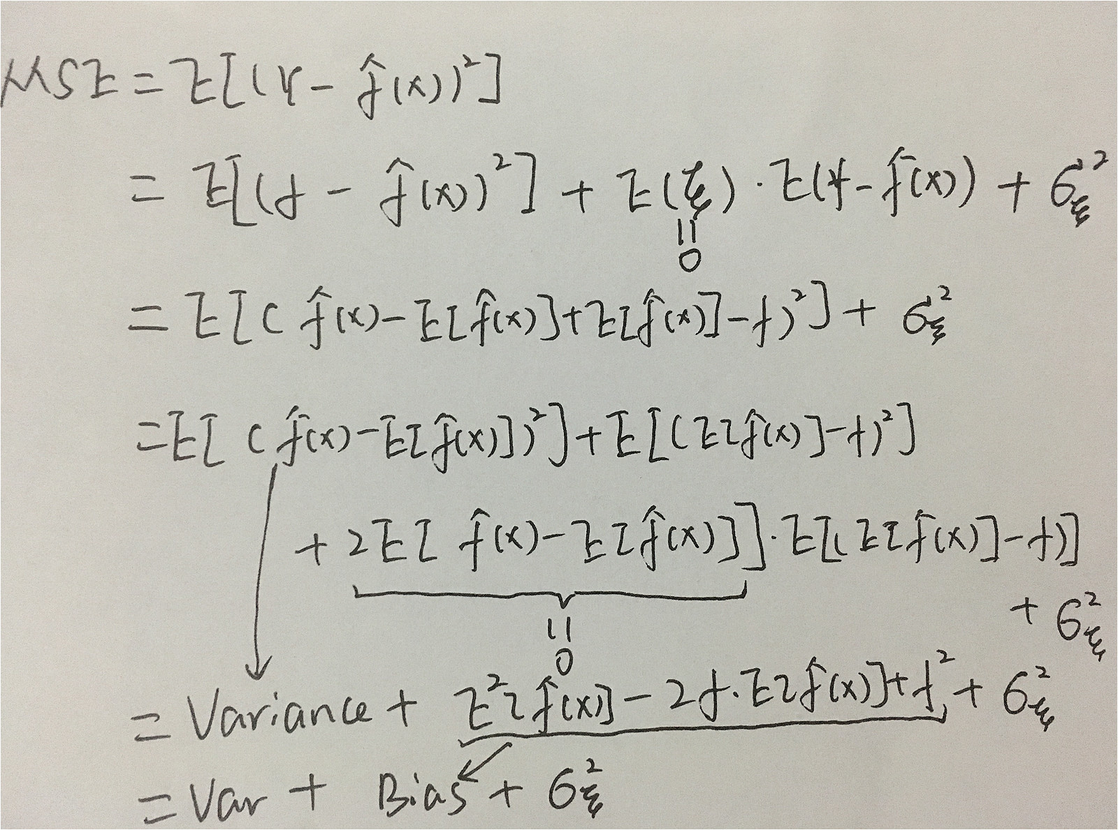
So the equation is composed of 3 parts: variance, bias and irreducible error which is the noise term in the true relationship and can’t be reduced by any model.
Tradeoff between variance and bias: With the increase in model complexity, the bias drops down and var goes up. At the same time, it will lead to overfitting, meaning your model performs too well on the training set, but poorly on testing data. Keep your model simple or introducing regularization are the methods to control bias. For variance, you can construct your data with resampling methods, then multiple models would be generated on these datasets, and finally got averaged to reduce variance.
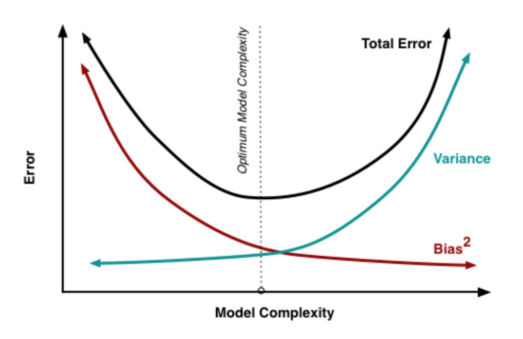
Figure 2. Bias & Var Tradeoff
Cost Function & Loss Function
Both functions deal with training error. In Andrew Ng’s Neural Networks and Deep Learning course, he gives very specific definition of the two: the loss function computes the error for a single training example; the cost function is the average of the loss functions of the entire training set. Then, to optimize the loss function or cost function), we can get the objective function, which is composed of empirical risk (related with loss/ cost function) and structural risk (related with regularization).
L1 & L2
L1-norm loss function tries to minimize the sum of absolute error between the targets and predictions. while L2-norm loss function changes absolute value into squared one. If the error > 1, then L2 will make the error become larger than L1. In this way, L2 is more sensitive than L1 on outliers.
Regularization is used to prevent overfitting by introducing a regularization term in the objective function to add penalty. L1 (lasso) is the sum of weights and l2 is the sum of square of weights. L1 can change large coefficients into 0, while L2 can only make the coefficient close to 0. Hence, L1 can works as a feature selection process.
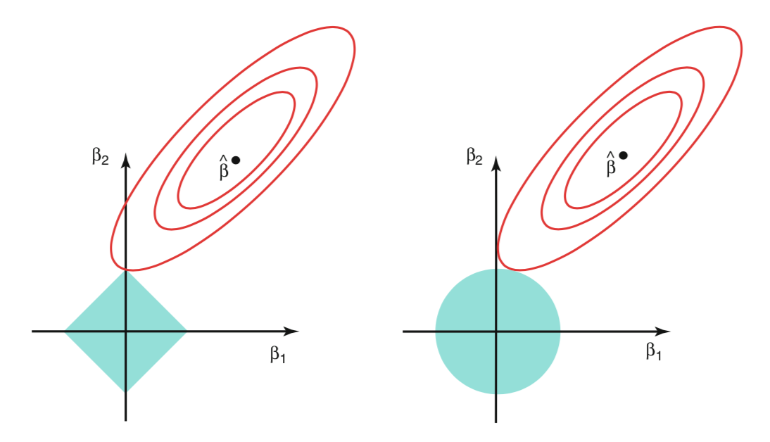
Figure 3. L1 & L2
Classification Evaluation
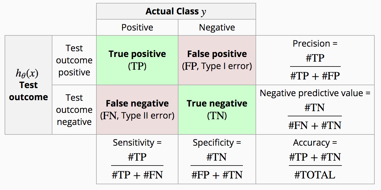
Figure 4. Diagnostic Testing Matrix
Specificity & Sensitivity
Sensitivity (recall,TPR) meansures the proportion of positives that are correctly identified. Specificity measures how good a test is at avoiding false alarms.
Precision & Recall
Precision tells the fraction of retrieved instances that are relevant (Precision = TP / predicted positives). Recall calculates the fraction of relevant instances which have been retrieved (Recall = TP / actual positives).
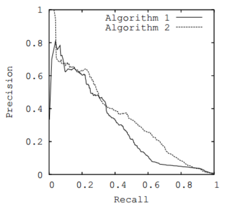
Figure 5. Precision & Recall Curve
So when make predictions of earthquake, we don’t mind to make too many alarms. Because our goal is to minimize the casualties, we want to have higher recall at the expense of precision. It will become a different when finding criminals. We will try to keep a high precision value. This is very understandable, as we don’t want to make troubles to the innocent ones. Of course, we want both precision and recall to be of high score, but there is a tradeoff between the two. So the decision should be made under the specific situation, whether we want high precision or more retrieve more information. In the precision/ recall curve, if the curve is more close to the point (1,1), the performance is better. Precision (P) and recall (R) can be combined in one meansure (F). If β -> 0, then we give more importance to P, else we focus more on R.
Fβ=(β2+1)PR/ β2P+ R
When β=1, we get F1, which is a single measure of performance of the test. F1=2(PR/ (P+R))
Micro-averaging & Macro-averaging
For multi-class problems, let C1,…, Ck denote k classes. For each class Ci, Pi = TPi / (TPi + FPi); Ri = TPi / (TPi + FNi)
Micro-averaging: Pμ=TP/ (TP+FP), Rμ=TP/ (TP+FN);
Macro-averaging: PM=1/K * (∑iPi); RM=1/K * (∑iRi)
ROC & AUC
It intends to evaluate the performance of binary classifier, with tpr as y axis and fpr as x axis. tpr=TP/ (TP+FN), fraction of positive examples correctly classified; fpr=FP/ (FP+TN), fraction of negative examples incorrectlt classified.
The vertical line in the figure below represents a threshold θ,which will be used when drawing the curve. If the prediction is on the right side of the line, then it will be predicted as positive; negative otherwise. When drawing ROC, we will start with the largest θ (point (0,0), meaning all the predictions are negative), and gradually decrease it (end point (1,1), all positive).
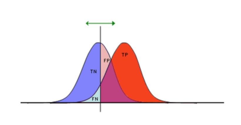
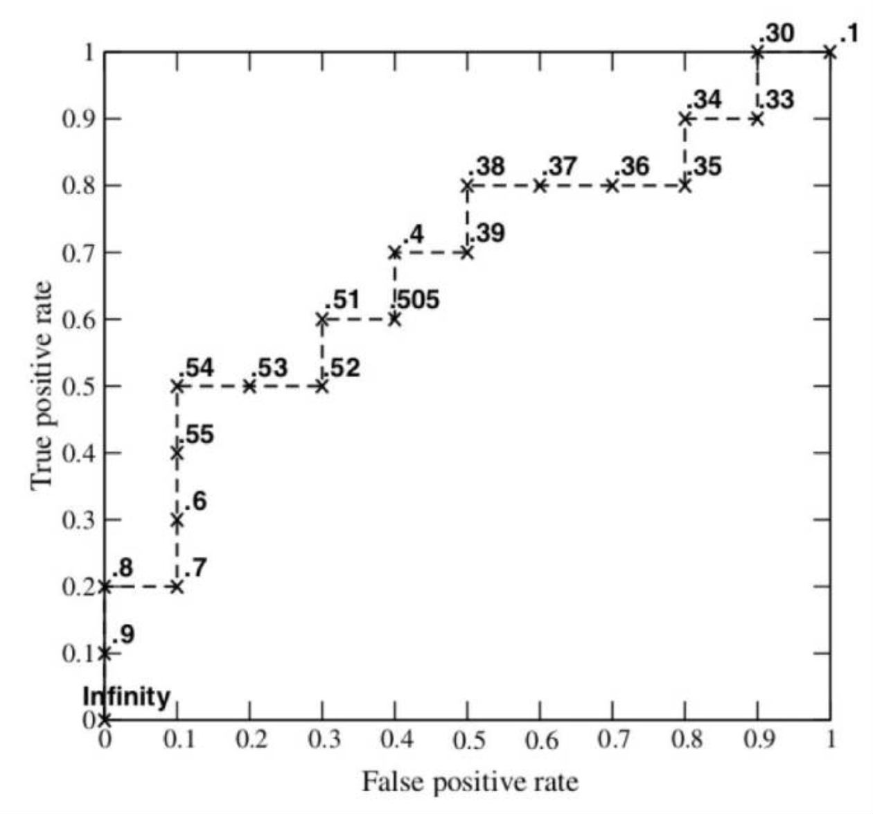
Figure 6. ROC Curve
select best classifier: Firstly, let’s conduct a formula transformation process. N: number of samples, NEG: number of negative ones, neg: ratio of negatives, POS: number of positives, pos: ratio of positives. acc = (TP + TN) /N = tpr*pos + neg - neg*fpr, so we can rewrite it into: tpr = neg/pos *fpr + (acc- neg)/pos, we can think it as a line, with slope = neg/pos, intercept = (acc- neg)/pos Given, the slope (neg/pos), we can move this line to obtain multiple tangency points with the ROC curve, through this we will also get multiple intercepts, and select the highest value from them. Then, we can get the blue line in Fig. 7. About the corresponding accuracy, the blue line will have an intersection with the descending diagonal line, project this point to the y-axis, we can get the accuracy score.
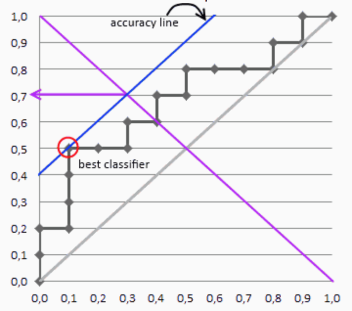
Figure 7. Best Classifier
AUC (Area under ROC Curve), also measures the performance of a classifier. AUC ∈[0,1], typically, AUC >0.5. The larger AUC is, the better performance the classifier will obtain.
Attention: If you are still confused about how the ROC comes out. Don’t worry, I will walk you through the ROC generation process step by step, and after reading this section, you will be able to draw ROC by hand.
Let’s take a binary classification problem as the example, given the left two columns(predicted probability and true y), I will start by setting the threshlod(the term ‘cutoff’ shown in the figure) θ at 0.9: so TP is 1, FP is 0, and TP+FN =5, which will always be 5 in this example, FP+TN = 5
So TPR = 1/5 = 0.2, FPR = 0/5, I get my first point(0, 0.2). Then, continue to decrease the cutoff, to calculate new TPR, FPR, I will get (0, 0.4), (0.2, 0.4)… as the following points. After I calculate all 10 points, I can draw the whole curve(shown in the bottom section in the figure). See, it’s not hard. I strongly recommend you to draw this curve by hand at least once.
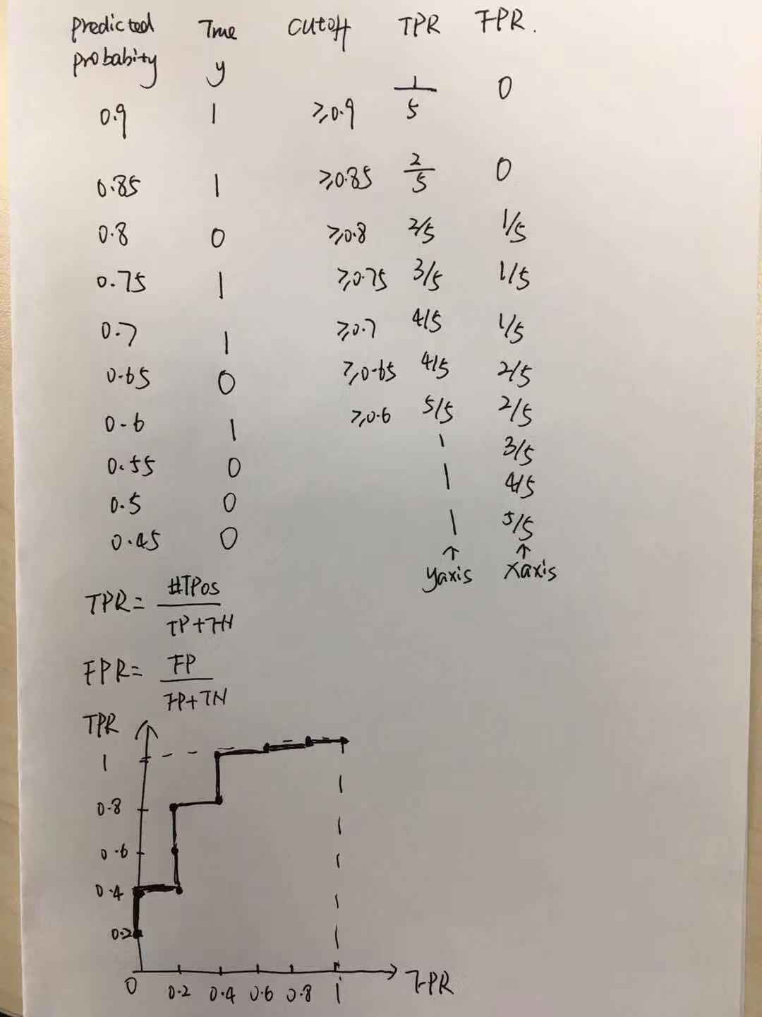
Figure 8. Draw ROC by Hand
PR Curve
PR curve is plotted by using precision against recall. Different from ROC, the curve reaches more to the right top corner, means the better model performance.
ROC & PR
ROC is insensitive to class distribution, if the ratio of positives to negatives changes, the ROC will not change, while PR curve will change dramatically. So if you try to change the ratio of pos/neg over time, ROC will still be very stable. In that way, it can reflect the performance of a classifier more objectively.
But when #neg » #pos instances, and you care more about the positive instances(e.g. predicting the morbidity rate of heart disease), it’s better to user precision recall curve than ROC to evaluate your classifier. This is because neither precision nor recall has included TN in the formula, so no matter how large proportion of #neg is, it won’t affect the PR curve.
Example: a highly skewed dataset: 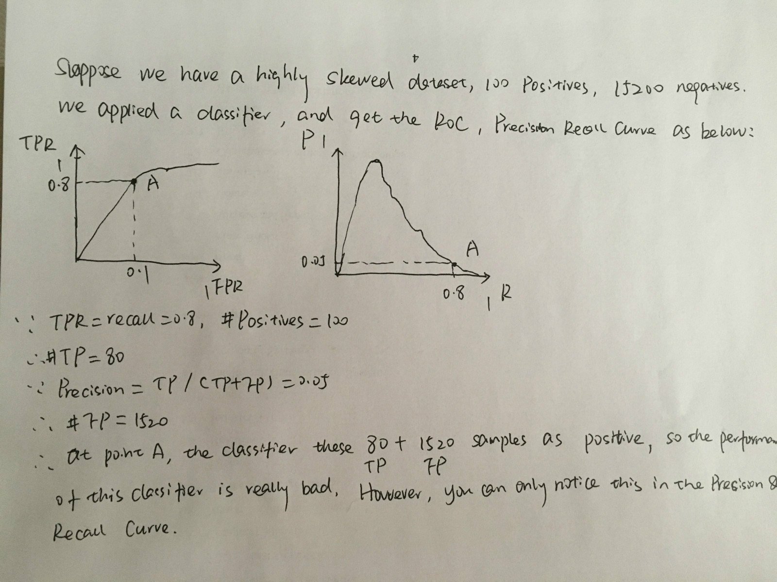
Tips: In such case, accuracy is not a good classifier indicator. Because the major class will influence the accuracy score heavily. Suppose we have 90 pieces of positives, and 10 negatives. If the classifier gives the prediction output that all these 100 records belong to positive class, then the accuracy will be 90%. It seems like a good classifier, but actually it misses all the negative samples.
To be continued…
Reference
[1]. http://scott.fortmann-roe.com/docs/BiasVariance.html
[2]. https://stats.stackexchange.com/questions/179026/objective-function-cost-function-loss-function-are-they-the-same-thing
[3]. http://www.chioka.in/differences-between-l1-and-l2-as-loss-function-and-regularization/
[4]. https://en.wikipedia.org/wiki/Sensitivity_and_specificity
[5]. http://mlwiki.org/index.php/Precision_and_Recall
[6]. http://mlwiki.org/index.php/ROC_Analysis
[7]. http://blog.csdn.net/pipisorry/article/details/51788927
[8]. Fawcett,Tom. “An introduction to ROC analysis.” Pattern recognition letters27.8 (2006): 861-874.
[9]. http://www.chioka.in/differences-between-roc-auc-and-pr-auc/
[10]. https://www.quora.com/How-do-I-draw-an-ROC-curve
[11]. https://stats.stackexchange.com/questions/132777/what-does-auc-stand-for-and-what-is-it

Leave a Comment